 |  | 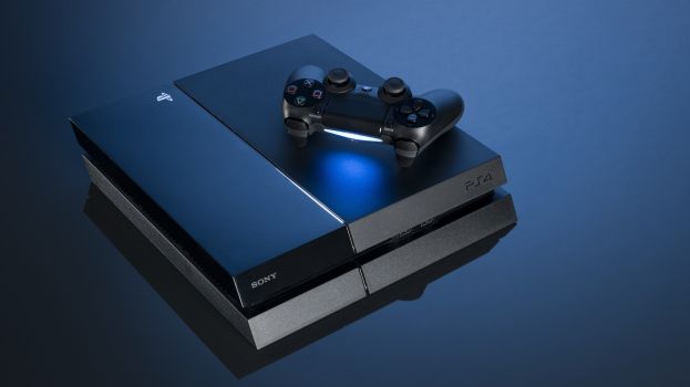 |
In advertising, color is an incredibly important part of marketing a product. For this assignment, I chose three images of the PS4 which all use a dominant color of blue with black and white as side colors. This color scheme has been used for this line of consoles since the PS2. This bright blue feels advanced and reminds me of technology. The marketing team for the PS4 clearly want to emphasize that it is a sleeker, more advanced model. The picture on the far left uses the least amount of blue. The controller is black and there is a white background. This image is pretty simple with no distractions. If the blue light was a different color, such as red, it would feel more hostile. The middle picture uses the same blue color for a background and presents the console and controller in contrasting black. The lettering is white. These colors are comfortable and they work together. If other colors were used the whole feeling would change. The picture on the right uses a slightly darker blue for the background but it is similar. The blue light from the controller is still the same. This color scheme is interesting to me; t's expansive and inviting with a technical feeling. If the marketing team changed the blue color, I think the PS4 would be less appealing to a lot of people. It would not fit in with the Sony image.
